
introduction
Inspired by the announcement of the next Avatar series, Avatar: Seven Havens, I conceptualized and designed a speculative teaser campaign. This project explores the story through a minimalist, symbolic visual language. While little is known about the official plot, reports confirm that the narrative centers on twin protagonists with one of them being the Avatar and is set in the aftermath of global unrest.
The goal was to create artwork that speaks to longtime fans of the franchise who’ve grown up with the series and are eager for the next chapter. The campaign invites curiosity, nostalgia, and speculation while staying true to the spirit of the Avatar world.
brief
With limited official information available, the objective was to imagine what early campaign visuals might look like such as the key art without overstepping or inventing narrative details. The approach centers on:
Book Earth as the elemental and visual focus
A minimalist, symbolic tone
Themes of balance, duality, and connection
The challenge was clear: design something that feels at home in the Avatar franchise, yet stands on its own without relying on established characters or lore-specific imagery.
CHALLENGES
One of the core challenges was working within the unknown. With no character designs or confirmed plot points, I avoided using recognizable silhouettes or literal depictions. Instead, I grounded the work in thematic continuity, pulling from previous series and worldbuilding.
By focusing on what is known such as the theme around Earth and narrative themes I was able to build concepts that feel credible and resonant while honoring the franchise's future direction.
research
I studied key art from both Avatar: The Last Airbender and The Legend of Korra to better understand how the franchise communicates through imagery. Though most official art is character-centric, it uses symbolism in meaningful ways like Aang’s arrow, the bending glyphs, and the flowing spiral motifs tied to elemental motion and spiritual energy.
These references informed the aesthetic foundation of my work: motion through linework, meaning through minimal form, and an emphasis on balance.
typeface/color
Typography in the franchise evokes tradition and legacy. I explored brushstroke-inspired typefaces and Asian-influenced scripts that could echo the tone of past series while feeling fresh and unique to Seven Havens.
For the color palette, I leaned into earthy tone greens, ochres, and muted neutrals to reflect the Earth Kingdom focus. Just as previous Avatars and characters are visually tied to their element through costume and tone, this visual system uses color to suggest origin and identity without needing to depict it literally.
Concept development
Early explorations focused on questions like:
What if the nations no longer stood as four? What if boundaries blurred?
I experimented with visual concepts that explored:
Unity and fragmentation through abstract forms
Duality through mirrored structures, referencing the twin protagonists
Balance and destiny via motifs reminiscent of yin and yang
Since we know the series explores catastrophe and rebirth, I integrated fractured motifs, cracks, shattered landscapes, and symbols to suggest a world out of balance. Earth as an element is weighty, grounded, and dense, which I reflected in later drafts with heavier line weight.
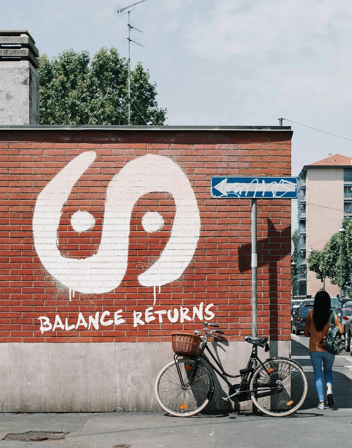
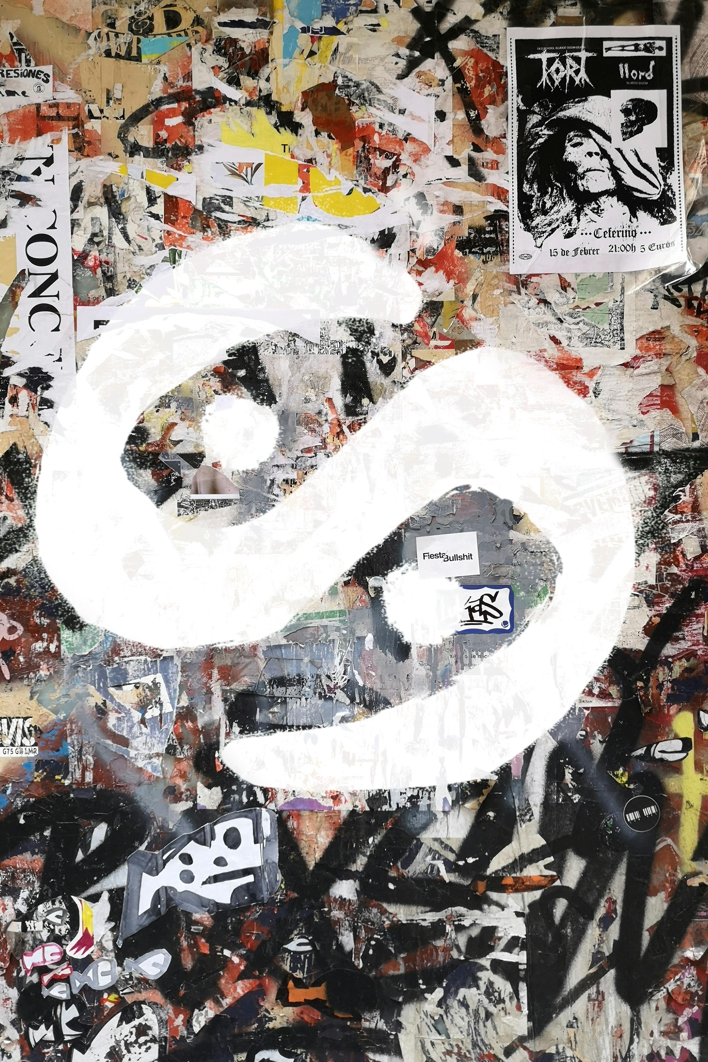
what is the s and the 2 dots?
I created this symbol because in Avatar symbols are used throughout the show to tell stories. I wanted to create my own symbol to tell the story of the new series. It’s a variation of the yin and yang, but instead it represents the two main characters of the series that are connected by destiny through an interwoven fate. The idea is that the duality of these two characters together will bring balance.
Concept development 2
I chose to focus on symbolic imagery as a storytelling tool specifically through a custom designed emblem that reflects the themes of balance, duality, and destiny. Early in development, I created a simplified version of this symbol to establish a clean, versatile visual anchor. As the concept evolved, I iterated a more detailed version that evolved over time.
In the final artwork I layered multiple concepts to look almost like a painted story in stone. For instance, the detailed iteration is used within a cracked map motif—representing a fractured world—and is framed by a graphic element seen in earlier Avatar title sequences. This frame for me symbolizes how stories are presented in the show and wanted to do that as a call back for the fans. Together, these elements create a piece that feels part of the universe and open to new interpretation.
ANIMATION DRAFTING
To further expand the campaign’s narrative scope, I developed a short animated teaser to showcase major past events while teasing the tone of what's next.
Scene 1: The Fire Nation’s domination symbolized by color washes overtaking the land, ending with Aang's intervention
Scene 2: Korra opening the Spirit Portal rendered as a pulsing vertical light column
Scene 3: Two spark like lights representing the new protagonists merge into the series symbol
Captioned fades between scenes offer both recap and tease, guiding viewers through memory and into mystery.
Set in a reimagined world of elemental balance and spiritual unrest, Avatar: The Seven Havens introduces a bold new era of the Avatar universe, where twin protagonists emerge, but only one carries the mantle. This conceptual campaign rollout focuses on building intrigue and cultural relevance through strategic teaser placements, symbolic visuals, and phased storytelling. The campaign aims to reintroduce the franchise to a new generation while preserving the mystique and depth fans expect, using a minimalist and world-building-first approach that grows with each phase.
•
MOCK UPS
• MOCK UPS
PHASE 1: Mysterious Emergence
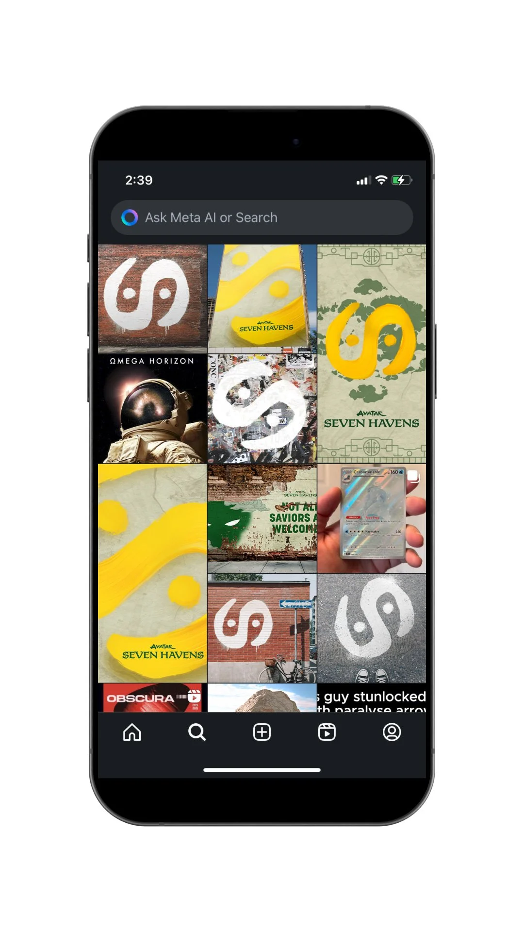
In the first phase the tactics would be graffiti of of the ying yang logo across various surfaces like walls, stones, concrete some with captions to hint at something. The idea is that these would be strategically placed out in the open and places themed around Earth to get people who pass by to share and talk about it through social media.


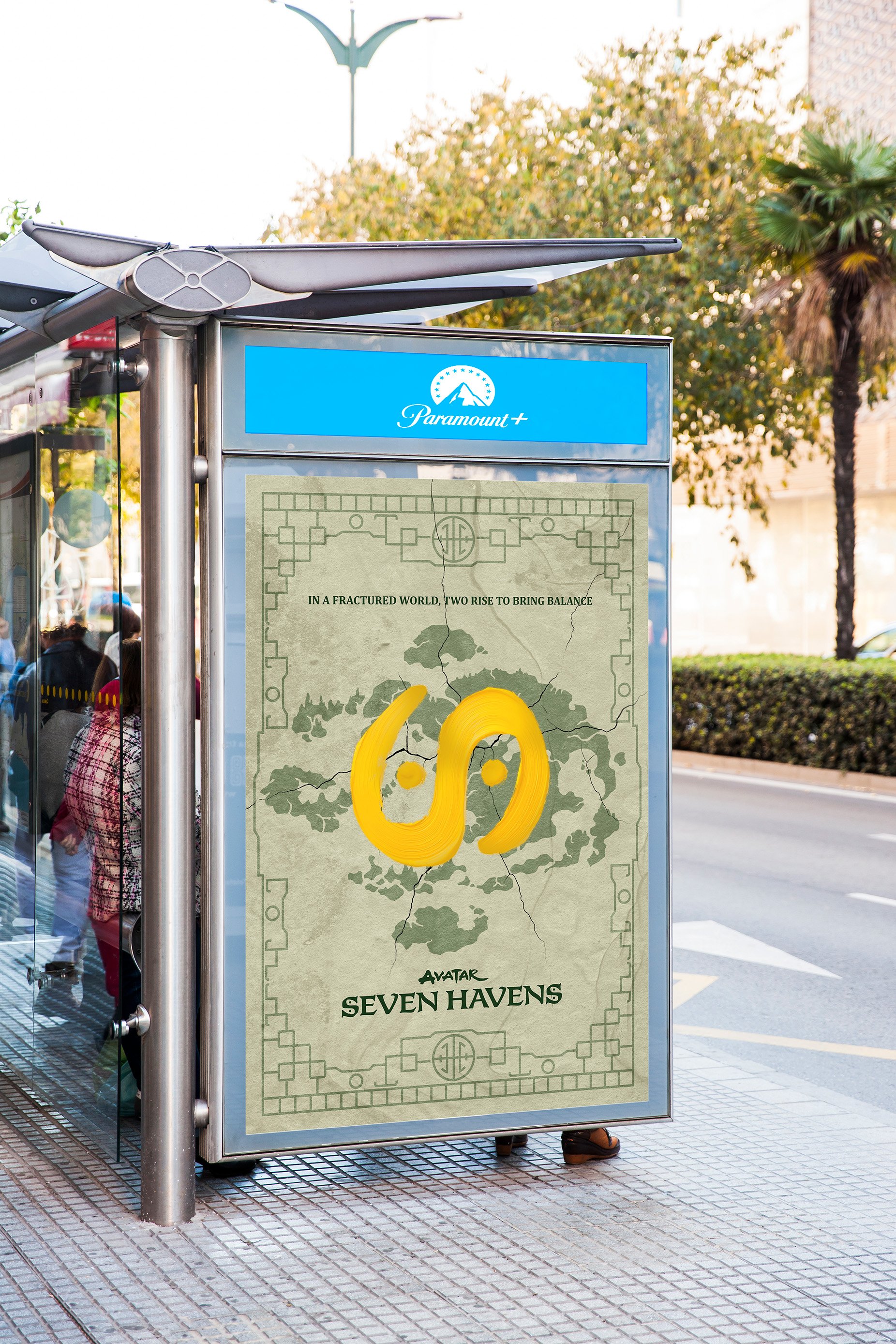
PHASE 2: Key Art Release
The second phase would involve releasing key art to connect with the symbol. This means releasing a key art poster so people can connect the what they have been seeing is a message of the upcoming release of a new Avatar series.


PHASE 3: The New Avatar
Now that the viewers know there is a new Avatar series this would continue the tradition of the show of “who will it be” but with a twist since to help tie into the tease of the plot of the show. I used the artwork with the silhouettes of the characters and split through the face to imply two faces.


PHASE 4: Campaign Expansion
We would continue to expand on the campaign and release the final teaser poster. While looking over the key art posters I felt that the different versions could have been utilized so I had the first poster released for phase 1 and a finalized version for phase 4 and release an animated trailer that replays the the build up of all the previous series and leads into the new one.

closing statemenT
This speculative campaign direction for “Avatar: Seven Havens” was designed to evoke tonal fidelity to the Avatar universe while leaving space for narrative mystery and audience speculation. Every visual element, from the cracked symbol motif to the silhouette composition, serves as a launchpad for modular storytelling across static, motion, and out-of-home channels. Rooted in restraint and cultural reverence, this campaign was not to answer questions, but to ask the right ones by inviting viewers, and studios, into a world still forming.