

PROJECT OVERVIEW
For this passion project, I reimagined the marketing campaign for Shaun of the Dead through a modern lens. My goal was to retain the film’s iconic balance of humor and horror while presenting it with an atmospheric, design forward approach inspired by studios like A24. I developed a full key art system, teaser concept, trailer direction, and social first promotional rollout exploring what the campaign might look like if the film premiered today, tailored to younger Millennial and Gen Z audiences who discover films via TikTok, YouTube, and visually driven media.
goals
Rather than simply paying homage to the original campaign, I wanted to build a world driven marketing concept that reframes Shaun of the Dead for the 2020s. The campaign centers on Shaun’s everyday routine an allegory for emotional numbness and modern monotony gradually unraveling into chaos. This approach speaks to themes of burnout, repetition, and unnoticed crisis, designed to resonate with a generation steeped in digital fatigue and irony.
challenges
A key creative challenge was bridging the gap between a 2004 release and the media expectations of a 2020s audience. The original film existed in a pre social, pre streaming world. Reimagining its humor, tension, and commentary within today’s saturated digital landscape meant reframing the storytelling without losing authenticity. I focused on how the film’s ideas emotional detachment, autopilot behavior, and societal disconnection still feel eerily timely.
RESEARCH
While the original campaign leaned into action-heavy zombie visuals, I chose to focus on the quiet horror of routine. I analyzed trends in both zombie marketing and A24’s signature style pulling inspiration from minimal, typographically restrained posters like The Lobster and TUSK. I noticed how red functions not just as gore, but as a visual anchor. These insights shaped a more symbolic, subdued poster series where storytelling happens through composition and subtle detail.
PROCESS
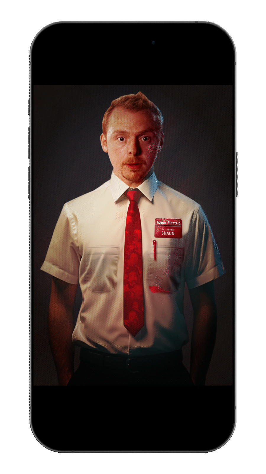
Initial concepts focused on Shaun himself, but felt too close to existing subway style campaigns. I pivoted toward a symbolic, restrained design featuring Shaun’s work uniform: a white shirt and red tie. This became the visual center of the campaign a metaphor for conformity and hidden chaos.
The red stain on the tie was my primary design anchor. As the concept evolved, I introduced hidden zombie figures within the tie to reward closer inspection and build rewatchable visual tension. I also developed a final version featuring Shaun’s face and enlarged typography, creating a more traditional key art piece that pairs with the teaser—an intentional nod to theatrical release patterns.
TRAILER PROCESS
To support the visual campaign, I developed a trailer concept that begins in dry, ordinary life and descends into escalating absurdity. The tone mirrors the film’s progression from slow burn to chaos. Using a storyboarded approach, I combined mundane clips with increasingly surreal visuals, guided by transition cards that slowly fill with blood and smudged handprints visually aligned to the key art.
The result is a tonal trailer that prioritizes escalation, irony, and restraint, matching the campaign’s visual DNA.
SOCIAL / COLLATERAL
To expand the campaign, I designed a suite of social-first assets:
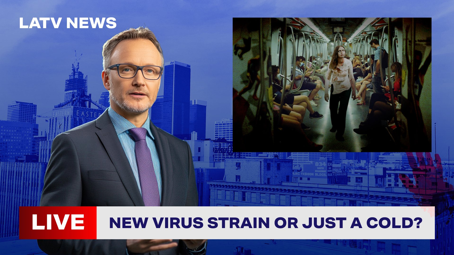
Fake news reports that mimic TikTok live streams and YouTube headlines about viral outbreaks
Mock Instagram drops counting down to the re-release
YouTube homepage takeover graphics simulating “breaking news” saturation
These assets help reinforce the campaign's core question:
“If a zombie outbreak happened in our distracted, always-on world… would anyone even notice?”
I also mocked up OOH placements bus shelters, digital billboards, and subway posters showing zombies blending into daily life. Each visual tells a mini story: chaos is coming, and nobody’s paying attention.

KEY ART AND MOCK UP
KEY ART AND MOCK UP

Early key art teaser

Supplemental poster Shaun in the bathroom

Supplemental poster Shaun in the store

Supplemental poster Shaun at the pub

Final version of key art release

Movie poster mock up

OOH bus advertisement

Wheatpaste advert
Animated movie gif

OOH Advert

OOH Advert

Advert mock up in bus stop

Public advert for subway

on the phone mock up

Fake news mock up advert

SNL fake advert

Youtube takeover advert

Social media countdown drop
Trailer video
This is a trailer I made for Shaun of the Dead to go with along with this campaign.
Final Thought
This campaign gave me the opportunity to play with genre reinterpretation through the lens of design strategy. My focus wasn’t just on making new posters—it was about asking: How do we make a 20-year-old cult film feel like it just dropped today?
By using visual restraint, world-building tactics, and subtle disruption, I aimed to modernize the film’s impact while honoring the original’s tone.